
A buyer lands on your event page and taps "Get tickets." Then they hit a dropdown that says "Section B, $45." They have no idea where Section B is. They don't know if it's behind a pillar or how many seats are left. So they do what most people do when they feel uncertain with a credit card in hand: they close the tab. Interactive seat maps fix that exact moment. And that moment is where most assigned-seat events quietly lose 30 to 40% of their sales.
This guide explains why a visual, tappable seat map converts so much better than a section dropdown. It also shows how to use one without rebuilding your whole stack.
Why seat selection is where ticket buyers drop off
Assigned-seat events have one high-anxiety step that general admission doesn't: choosing which seat. Think theaters, conferences, sporting venues, attractions. Get that step wrong and it turns into the single biggest leak in your funnel.
Three things go wrong with a text-based section picker:
- The buyer can't picture what they're buying. "Row M, Seat 14" means nothing without a map. And uncertainty at the payment step is the most expensive uncertainty there is.
- There's no real urgency. A dropdown that still has options tomorrow feels like it'll have options tomorrow. Nothing about it says "act now."
- People are scared of getting it wrong. Buyers worry they'll pay and end up with an obstructed view or a split-up pair. That doubt turns straight into abandoned carts.
An interactive seat map answers all three at once. That's why the conversion gain compounds instead of just adding up.
Where the 40% conversion lift actually comes from
The headline number isn't magic, and it isn't one feature. It comes from three effects that stack on each other, and each one removes a specific reason buyers bail. Swap a clunky section flow for a real map and you're not making one thing 40% better. You're closing three leaks that multiply.
Clarity: buyers see exactly what they're buying
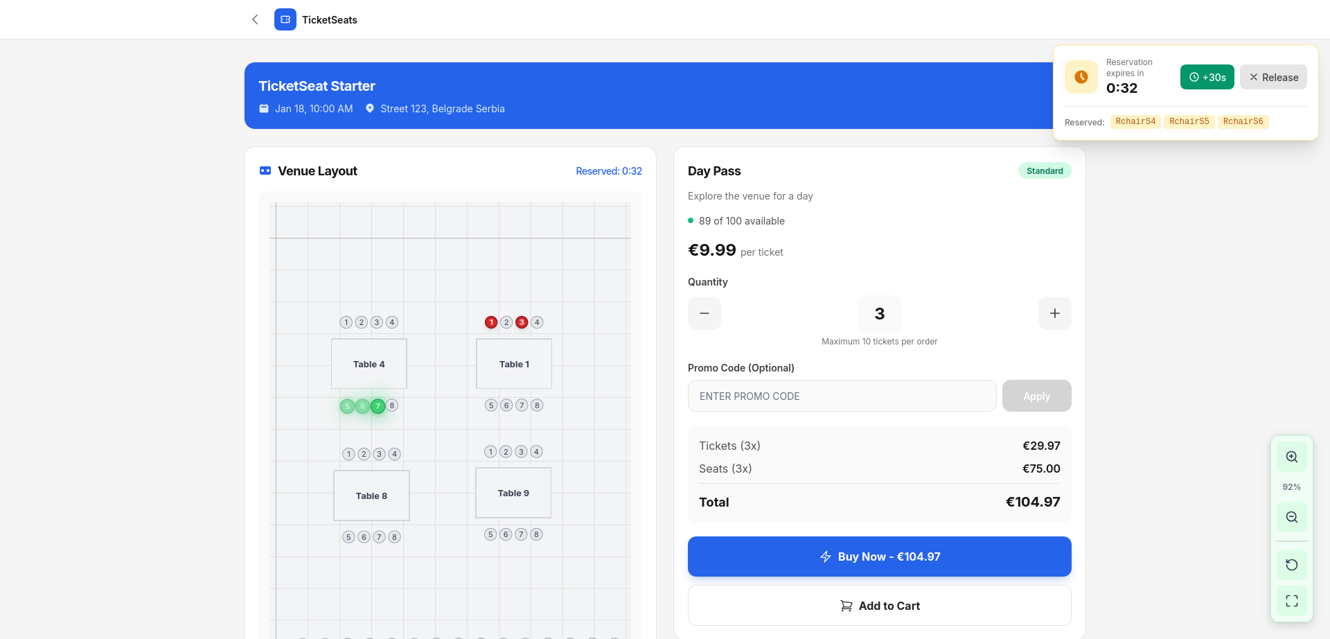
Customers see a visual map of your real room. They tap the exact seats they want, with sightlines, price tiers, and live availability right there at a glance. The guesswork disappears. They're no longer buying a label. They're buying a place. Clarity at the payment step is the highest-leverage change you can make, because it kills hesitation right where hesitation costs you the most.
Scarcity: a filling map creates real urgency
A dropdown hides how full you are. A map shows it. When a buyer can see the good seats going, when whole rows have already turned grey, urgency stops being a marketing line. It becomes something they watch happen with their own eyes. Visible scarcity is honest scarcity. It moves people off the fence, and you don't need a single countdown-timer gimmick.
Confidence: real-time locking removes the "did I get it?" doubt
The fastest way to kill a sale is to make someone wonder whether their seat is really theirs. Ticketseat's interactive seat maps hold a seat for 60 seconds the moment it's tapped, over a live WebSocket connection. Two people can never buy the same seat. Overbooking is impossible by design. The buyer commits without second-guessing, and you never send the refund-and-apology email that torches repeat business.
Clarity gets them to choose. Scarcity gets them to choose now. Confidence gets them through checkout. Stack all three and the lift over a plain section picker lands in that 30 to 40% range.
What "interactive" actually has to mean on mobile
Most ticket sales happen on a phone. So a seat map that only works on desktop isn't an asset. It's the same leak with extra steps. "Interactive" has to mean mobile-first. Pan, zoom, and tap to choose seats smoothly on a small screen, not a desktop SVG crammed into a phone viewport.
This is the detail that separates a real conversion tool from a checkbox feature. If picking a seat on a phone is fiddly, every gain from clarity and scarcity leaks right back out at the pinch-to-zoom step. Build the map mobile-first or don't bother.
Build the map once, sell from it everywhere
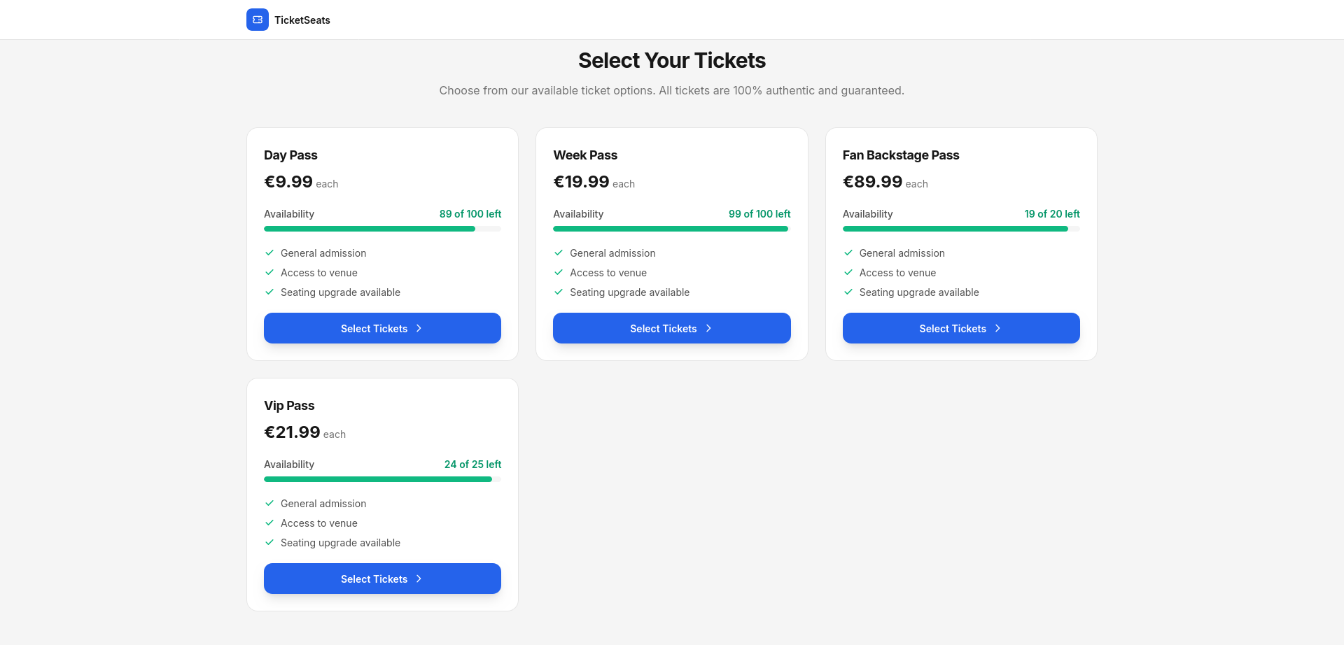
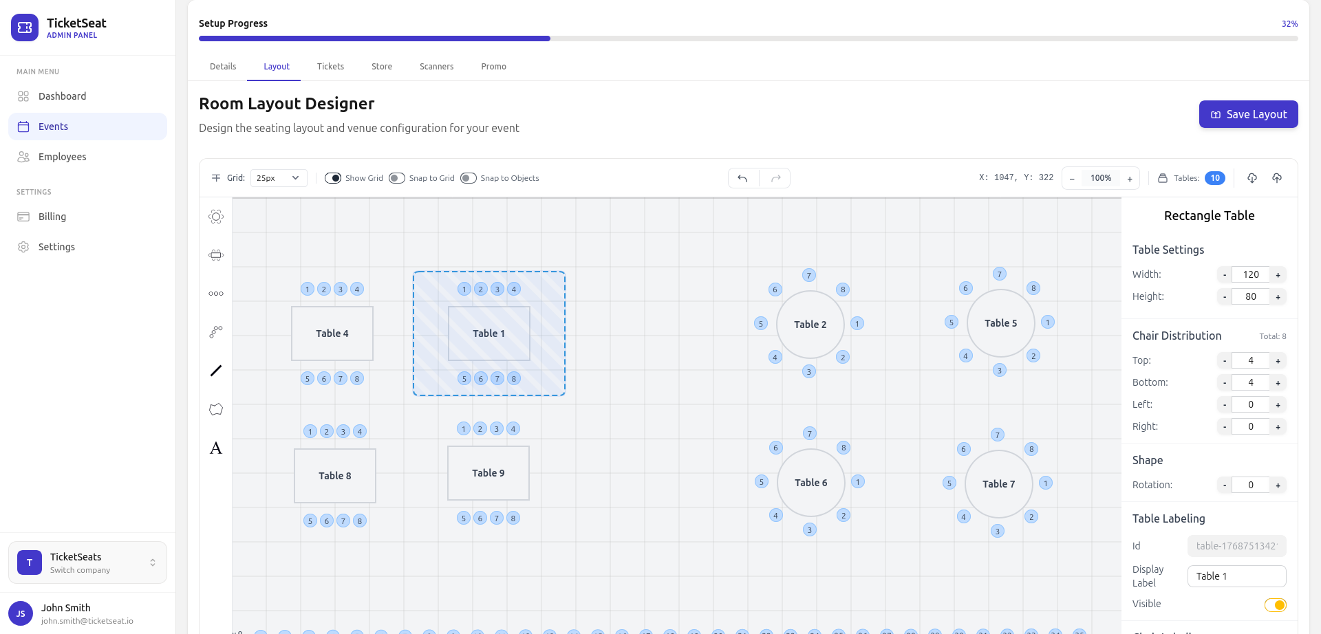
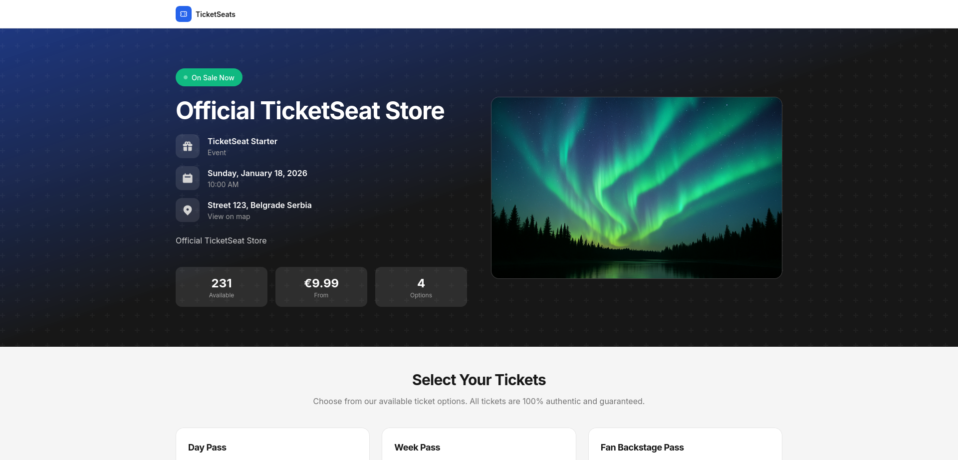
Teams avoid seat maps because they fear CAD-level setup. It shouldn't be like that. You draw your seating chart once in a drag-and-drop venue designer, with sections, rows, tables, and GA areas. The map mirrors your actual layout, so what buyers see on screen matches what they find at the door.
Publish the event and your branded store shows the live, interactive map with real-time availability. Seats lock on selection and clear automatically if someone abandons checkout, so your inventory stays accurate and nobody has to babysit it. Set it up once. Sell from it every show. If your events mix assigned and open areas, reserved seating and general admission live on the same map.
Measure the lift, don't assume it
A 40% claim is only worth something if you can see it in your own numbers. Before you switch, note your current completed-checkout rate. After, watch it in real time with built-in analytics. You'll see how many people who open the seat map finish the purchase, and which price tiers and sections actually sell. The map's job is to convert. The analytics are how you prove it did.
If you're setting up your first paid event end to end, the complete guide to selling tickets online covers the full flow around this step, including pricing, payments, promotion, and door scanning.
When interactive seat maps are worth it (and when GA is fine)
Seat maps aren't free effort, so spend it where location is part of what people pay for:
- Use a seat map when the seat matters. Theaters, concerts, conferences with assigned seating, sporting events, premium tables, and attractions where a specific spot has a specific value.
- Stick with general admission for standing-room shows, open meetups, and free events where every spot is equal. A map just adds friction with no payoff when there's nothing to choose between.
The test is simple. If a buyer would pay more for that seat over this one, an interactive map will earn its keep. If not, keep checkout one tap shorter.
Frequently asked questions
Do interactive seat maps really increase ticket conversions?
For assigned-seat events, yes, and the gain is meaningful. It comes from removing three specific drop-off reasons at once. Buyers can't picture a text-only section. A dropdown creates no urgency. And they fear picking the wrong seat. A visual map with real-time locking closes all three, and the effects compound instead of just adding up.
How does seat locking prevent double-booking?
The instant a buyer taps a seat, it's held for 60 seconds over a live WebSocket connection and shown as unavailable to everyone else. Two people physically cannot buy the same seat. That designs out overbooking, and the refunds that come with it.
Do seat maps work on mobile?
They have to. Most tickets get bought on phones, so Ticketseat's maps are mobile-first. You can pan, zoom, and tap to select on any screen. A desktop-only map would just bring back the friction the map is supposed to remove.
How hard is it to set up a seating chart?
You build it once in a drag-and-drop venue designer, with sections, rows, tables, and GA areas, then publish. The live store renders the interactive map automatically. Seats clear on abandoned checkouts, so inventory stays accurate on its own.
Should every event use a seat map?
No. Use one when the specific seat carries value, like theaters, conferences, premium seating, and attractions. For standing-room or free events where every spot is equal, general admission converts better because it keeps checkout shorter.
Turn seat selection into your best converting step
The seat-picker step is where assigned-seat events leak the most revenue. It's also where a real interactive seat map does the most work. Give buyers a visual map of your actual room. Let them see scarcity as it happens. Lock their choice in real time. The step that used to lose carts becomes the one that closes them. Build your map on Ticketseat, watch the lift in analytics, and compare the math against other ticketing platforms before you commit.
Ticketseat Team
Sharing insights about event ticketing, platform updates, and industry best practices.
Related Articles
View all
7 Best Eventbrite Alternatives in 2026 (Lower Fees, Reserved Seating)
Looking for the best Eventbrite alternatives in 2026? Here are 7 ticketing platforms compared on fees, payouts, seating and support, so you keep more of every ticket sale.

How to Set Up a Seating Chart for Your Venue
Building a seating chart for your venue, step by step. Map your sections, rows, tables, and GA areas in a drag-and-drop designer. Set your price tiers. Then sell assigned seats with zero overbookings.
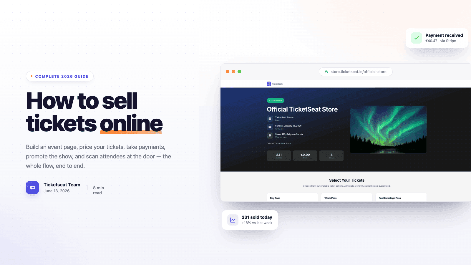
How to Sell Tickets Online: Complete 2026 Guide
A step-by-step 2026 guide to selling tickets online — build an event page, price your tickets, take payments, promote the show, and scan attendees at the door.
Compare Ticketseat
See how Ticketseat stacks up against other ticketing platforms.
Ready to Transform Your Event Ticketing?
Join thousands of event organizers who trust Ticketseat for their ticketing needs.